• KES Collections
  • About

KES Photography

~ Photographic Techniques Simplified

KES Photography

Tag Archives: composition

“What Happened…?”

08 Friday Dec 2017

Posted by Kathleen Scanlan in composition

≈ Leave a comment

Tags

composition, creativity, distortion, focus, image corrections, perspective, photo corrections, Photography, Photography information

Have you ever taken a picture and when you printed it out or viewed it on your computer or camera it didn’t look like the picture you thought you took? This is especially true when shooting buildings. Your eye sees the building as nice and tall with straight lines aiming towards the heavens. Yet, when you take the picture and look at it, it’s distorted? It happens a lot to beginners and even us in the middle. And then the big question becomes “why is this happening?”

I am not a pro nor am I beginner. I’m somewhere in the middle when it comes to photography. This means I enjoy taking images, manipulating them, and sharing them with those of the same mindset. So, I try to keep things simple and easy to understand. No technical verbiage for me. I’m that “whatchamacallit” person.

So here it is…one reason is that your perspective is off. For example, when you shoot close to a church and you step back to get the steeple in, you are changing the perspective. In the image below, you can see that the doors appear straight but as you take in the whole image, the rest of the church is distorted. The large windows seem to tilt in on the sides and everything in the middle seems to be fairly straight, although a bit tilted backward. Probably without even knowing it, you have had to tilt the camera up to capture the cross on the church as well as the front door.

Church #1-6667

I was standing just below the church, aiming slightly up which distorted the whole church except for what was at eye level (the doors) from where I was shooting. My lens was a 24-70mm zoom and I had it set at 24mm. It just didn’t work and I couldn’t step back any further as a very active street behind me restricted me from doing so!

How to correct it? Well, you can do several things:

  1. Change your angle. Step back so that you do not have to tilt your camera to capture the whole image. Sometimes you aren’t even aware that you are slightly tilting the camera to get everything within the camera frame.
  2. Not possible?  Option two is to not take the whole church. Move closer and capture just a window or the doors.
  3. Use a wide angle lens (if you have one)
  4. Take the shot the best you can. Then, in post processing, straighten it out as much as you can without causing more distortion. (More on this later)

I adjusted the horizontal and vertical lines of the image in Lightroom to help “straighten” out the church. As you can see below, I lost a lot of the content of the picture in post-processing. But at least you won’t get dizzy looking at it!

Church #2-6667

If you can’t change your position and don’t have a wide-angle lens, take the picture. Just ensure that your image doesn’t fill the frame like I did in the first picture and has plenty of border space around the church for post-process straightening. I didn’t and lost quite a bit of the image when I corrected the horizontal and vertical distortions in Lightroom.

This last image is of a church I had plenty of room to change my position to reduce the  in-camera distortion.  Although there is still a little bit of distortion, it is not very noticeable and the image is pleasing to the eye. (The small entrance to the right really was tilting toward the main building…!)  I did make some minor perspective changes, i.e., cropping/leveling and a little correction on the horizontal lines.  Other than that, this image is how I saw that little farm church that day.

Church #3-0741

So, the next time you are taking a picture, check to make sure your perspective is good; that you are on equal footing with the object that you are taking. If you don’t have the room to do that or a wide angle lens, then make sure you have enough clear space on all four sides in the viewfinder so that when you make your corrections in a post-processing program such as Lightroom, you don’t cut off anything of importance (like the cross on top of the steeple!).

There is another reason why the distortion occurs and it has to do with the camera itself.  And the fact the world is round!  But that’s for another blog…  Until next time, happy shooting!

Advertisement

Share this:

  • Email
  • Twitter
  • Facebook
  • Pinterest
  • LinkedIn

Like this:

Like Loading...

Composition and Lines

17 Friday Nov 2017

Posted by Kathleen Scanlan in composition

≈ 2 Comments

Tags

composition, creativity, focus, garden, gnome, lines, Photography


Hi Everyone. Building on my last blog about lines in images (November 10, 2017 “Leading Lines”), this week I thought I would show you how composition and lines really work hand in hand. There is no doubt that there are shots which probably will not have any apparent lines to follow but if you look, you will find them!

When composing a shot, whether it is a portrait or a simple landscape, its always important to double-check what you see in the viewfinder. As mentioned in previous blogs, with practice it will become second nature. Watch for things cut off by the edge of the frame or something sticking out of your subject’s head that shouldn’t be there! Although the latter might be funny at first, the subject might not think so later. Now, if that was your intent, to have a tree growing out of their head well…great!

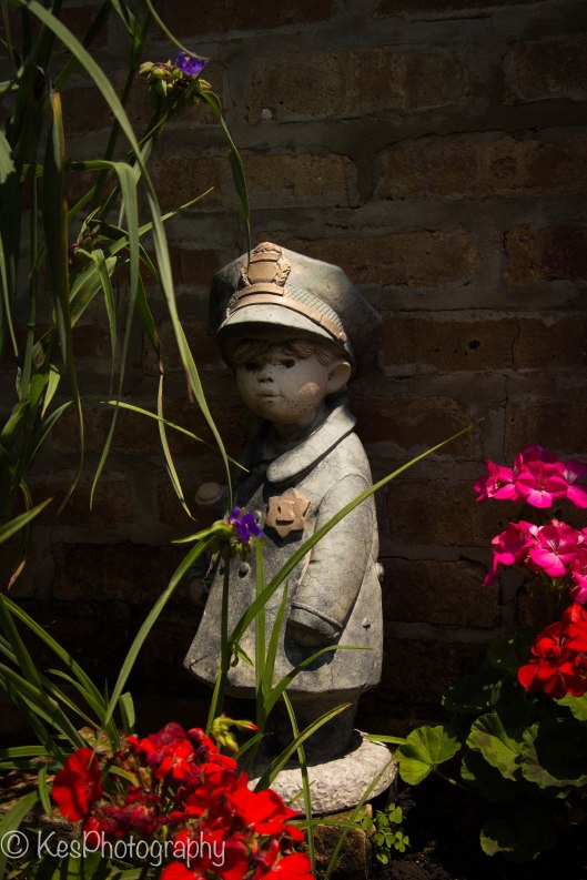
The images I have below are from my backyard garden. I love shooting with natural light and really enjoy capturing it at all angles when I can. Today, I want to show you how to create a story with your image without words. The title of these images is Garden Cop. My thought process was to capture this little figure peeking out from the flowerbed. I wanted the viewer to get the sense that this little guy was looking out for the flowers and was working his beat, doing his duty.

Although the image does have something of the rule of thirds on an angle (upper right corner empty, bottom left filled with flowers, and center angle with the subject matter) drawing the eye to the little officer, the greenery is going every which way. It just does not feel balanced. The lines of the greenery really don’t point to any one thing. Not a terrible image but could use some improvement.

Compo2-0036

So, I changed my position and focused on the statue’s face. As you can see, the green lines now frame the face pretty good but are such a distraction that its difficult to really determine what I was aiming at with the image. Yes, I wanted to focus on the cute face, but all the greenery pulls the eye to the unfocused forefront of the image. Way too busy. The face looks so small in the image that the story gets lost. It’s just a shot of a statue in a garden. …Kind of dull, to my way of thinking.

Compo1-0044

My final product is what I was looking for in an image. By slightly changing my position from the front of the statue, focusing on the face, and watching the green “lines”, I captured this little copper on his beat in the garden. As you look at it, the left side is not longer so thick with a mishmash of lines and they are now in a soft focus. The wall on the right is slightly darker in the shade, and my copper has enough sunlight to draw attention to him. Although the face is in shadow, it looks natural. As you can see, I framed his upper body with the greenery so the viewer is focused on the statue.

Compo3-0037

In the end, I had to really look for the image lines, make sure they helped to focus the eye on my subject, and move around until I had the right composition to tell my story. Did it work?

Everyone takes pictures today. Everywhere you are, you can see someone snapping off a shot. What makes one image stand out against another is the composition. Did the photographer clearly identify the subject matter? Is it in focus? Are there distracting lines disrupting the flow of the image? When you look through your viewfinder, ask yourself this…”What is it that I want my viewer to feel and see?” “How can I help him or her focus on what I want them to feel and see?” “How can I take this average shot and make it into something wonderful?”  If you ask these questions of yourself before you take that shot, you are on the road to a great composition. One that will take their breathe away and have them asking you “how did you do that?” Have a great day and have fun with your camera!

Share this:

  • Email
  • Twitter
  • Facebook
  • Pinterest
  • LinkedIn

Like this:

Like Loading...

Leading In…

10 Friday Nov 2017

Posted by Kathleen Scanlan in composition

≈ Leave a comment

Tags

attention, background, composition, focus, images, leading lines, lines, story

Leading lines. Everyone seems to talk about them when it comes to Photography. What are they and why are they so important when composing your image in camera? Is it really necessary to keep an eye out for them in the viewfinder? The simple answer is yes.

If you are not aware of what leading lines are, here it is in a nutshell.  Almost every photograph has some form of lines in it.  The lines could be bridges, roads, sidewalks, windows, trees, buildings, pathways, household furniture, etc.  They can be curved or straight but more importantly, they lead the eye toward something in the image. Many people simply snap the picture for posterity and don’t worry too much about how the lines interact with the entire scene.  And that’s fine. But if you want to tell a story with your image, then lines are very important in directing attention to your subject.

As you look through the viewfinder, get into the habit of doing a “once over” of the entire image with your eye.  It only takes a second.  With practice, you won’t even really notice you are doing it whenever you take a shot. In that second, you will see the full image, notice if there are any distinguishing lines, and much more (to be covered at a later date). Practice taking a step back from the scene and really look at it. I think of it as putting distance between the actual scene before me and what I want people who see the image to actually “see” and feel. The human mind processes data with amazing speed which means I have plenty of time to take it all in.

Sometimes, simply by shifting your focal point a bit, the “lines in the image will draw more attention to your subject matter.  Instead of the image being chaotic and resulting in the viewer being a bit confused as to what you want them to see and feel, you “aim” their eyes to the very thing you want to grab their attention.

In this first image below, the viewer can clearly see the lines of headstones leading to the trees and blue skies at Arlington National Cemetery.  Although the story is the amount of men and women who gave their lives for their country and are remembered with wreaths during the Holidays (Wreaths Across America organization), it also points to serenity and beauty.  The blue skies and trees in the background help to soften the pain and anguish one may feel for the many lives given for our Freedom. Is that what you see and feel?

Arlington Wreath Laying-3315

The second image has all the rows heading out into the distance. And if you follow those rows, you can see that they continue on and on. There are several lines in this photo. The white headstones leading into the cemetery, the shadows of the headstones pointing toward the ones in front of each line, and the tree trunks and two people at the top of the image drawing the eye upward and inward,. Do you see it? Simply by adjusting my position to capture the shadows of the headstone, I added lines, which pointed to each soldier buried there as if to say “we are all one”.

Arlington Wreath Laying-3247.jpg

Now that you see how lines affect an image, take a look at this last one. The only thinking I did was that I wanted a picture of Audie Murphy’s headstone. I did not take that second to look at the whole scene before me. I simply focused on the headstone and pressed the button, because I wanted the headstone to take center stage. Unfortunately, I did not take that second to really “look” at the scene in the viewfinder resulting in a very chaotic and distracting background. Headstones going every which way, too many people at the top of the image, the angle of light “whited out” the tombstones…I could go on and on as to why this image is simply a snapshot that does not tell any kind of “story”.

Arlington Wreath Laying-3331

Are leading lines important? In my opinion, yes. If you still don’t think as I do, that’s fine, too. What I would suggest is that you pull out your past photographs and really look at them. Would using the lines in the image have helped improve it? That is the question of the day! Have a good one until next time!


Share this:

  • Email
  • Twitter
  • Facebook
  • Pinterest
  • LinkedIn

Like this:

Like Loading...

How Close Can You Go?

09 Friday Oct 2015

Posted by Kathleen Scanlan in Photography

≈ Leave a comment

Tags

Background blur, close-up, composition, focus, framing an image, Photo information, Photography, Photography information, zooming

This week, I thought that instead of just harping on some of the do’s and don’ts of composition, I would show you what I did with a Canon DSLR (Digital Single Lens Reflex).  This can also be accomplished with a point and shoot camera or even a cell phone one.

In the past, I have talked about thinking before shooting.  What do you want in the image?  What is your subject matter?  What “feel” do you want the viewer to have?  What’s the story?  The next step is to take the image, of course.  So….

I went for a walk on a  spring day.  It was slightly cloudy but the sun was coming through enough so that a flash was not required (I prefer non-flash images, anyway).  As I walked down my city sidewalk, my head was on a swivel, looking for that one image that yelled “spring has arrived!”  Most people tend to look toward the ground for fresh greenery just breaking ground after a long winter.  Me?  Well, there are days when getting low to the ground for a good shot just aren’t in the cards!  As it was this particular day…

So, heads up and full speed ahead.  Literally.  My eyes were on the trees.  Unfortunately, they didn’t seem to be quite ready for spring.  The branches appeared to be bare.  No apparent budding happening yet.  At least it seemed that way so I changed my though process (I mentioned this in a previous blog. Don’t be afraid to change your mind when out on a photo jaunt).  My new thought was to capture something that reflected the last of winter, like a brown leaf or a fallen acorn left over from last year.  And voila!  I found what looked like an old brown tree flower.

Brown Flower Seed

Brown Flower Seed

It looked so lonesome on the brown branch.  As if it had weathered the rough winter and still hung on for good measure.  The petals were still nice and crisp.  The last of the fall tree flowers.  That was my thought, anyway, when I looked at it.  (Pretty sure there are no such things as Fall tree flowers but my brain doesn’t always accept common sense when I am out with my camera!)

My thought process; focus on the forefront one and keep the farther one out of focus because the back one did not have the nice flowery look to it.  The petals seemed to be bent backward from the center (you can kind of see it in the picture) and the sun highlighted them a bit.  Also, I wanted the background very blurry because it was distracting with fencing and buildings.

Since I was using my DSLR on manual mode, I was able to play with a few settings (ISO, F-stop, and speed) to get what I wanted.  My lens was a 18-135mm zoomed to about 64mm.  We will get more into these numbers and how to play with them in another blog for those of you who have the ability to do it with your particular camera.  But most digital point and shoot cameras as well as telephone cameras have the ability to zoom, so you should be able to get somewhat the same effect as I did.

After finally settling on the image I “envisioned” as the final product, I downloaded it to my computer.  Mind you, I took about 30 images from different angles before I decided this is the one that captured what I wanted to say.  The digital age is a wonderful thing for photography!  No more wasting film or paying for processing of unwanted images!

Now it was time to check out all the details of the petals.  This is when I received my shock…this was not a flower at all.  It was a tree bud of sorts.  The so called-petals were protecting the seeds that the tree would eventually drop.  Since I tend to be very focused when I look through the viewfinder attempting to get the “framing” the way I want, it means sometimes I miss some of the finer details that the camera will pick up.  My focus was on the “flower” and not what it was hiding.

In the middle of the bud are several seeds.  You can seem them in the image below. I cropped the image so that you could see what I missed!   It’s probably one of my favorites of bud images as I have never seen one like it before or since. The bud almost seems to look like a face and is sticking its tongue out at me (that’s just my imagination running wild!).

Close-up of

Close-up of “flower”

As you can see, only the bud shows detail and the branches are out of focus.  All attention is on the “petals” and when you look closely, you see the seeds.  This is what I had talked about in previous blogs about composition.  When someone looks at your image, what draws them into it?  Or is it “flat”, meaning that what you see is what you get.  Had I simply shot this piece without zooming in, the background would have detracted from the bud.  Everything around it would have been as sharp as the bud and the person looking at the image would probably miss the seeds all together.

But with focusing and zooming in on my subject (and a few minor adjustments), the viewer now sees the detail and is drawn into the bud by the white petal that supports the seeds.  My subject matter stands out without anything to impede on the visual aspect of it.  The out-of-focus bud in the background lets the viewer know that this is some kind of tree or bush and not a ground flower.  I purposely placed the subject in the lower right quadrant of the frame so that the viewer would see it first and the lines (branches) lead into the image to show that there are other ones like it on this tree. It would have been nice to have had the sharper bud in the upper left quadrant with the “lines” leading to it but mother nature decided that was not to be.  Sometimes you just have to go with what you got. And yes, this is the actual color of the bud.  Definitely not a spring color!

So, the next time you head out with your camera, look around.  Try getting closer to your subject.  You never know just what your camera will capture.  The human eye adjusts and takes in tons of information.  It’s the camera that actually captures what you really see.  Grab your camera and go!

41.878114 -87.629798

Share this:

  • Email
  • Twitter
  • Facebook
  • Pinterest
  • LinkedIn

Like this:

Like Loading...

What’s the point?

02 Friday Oct 2015

Posted by Kathleen Scanlan in composition, Uncategorized

≈ Leave a comment

Tags

composition

When you look at a picture, your brain immediately decides what the image is all about. It could be a family party, a wedding, a beautiful landscape shot, or a wonderful pet portrait. The more you look at a particular image, say a family gathering, you start to pick out things that don’t hit you the first time around. Aunt Sally holding an empty wine glass, Joey spitting up on Uncle Tim, the birthday cake about to fall off the table, or maybe that everyone has the same, silly smile on their face! These are fun shots that years from now will be priceless.

But if you are looking to shoot more refined images that you would like to hang on your wall, sell as fine art, or as stock photos, now your thought process has to change from point and click to “what do I want to the viewer to see and yes, feel”.  What do you want to evoke in the person viewing your piece of work?  Beauty, vastness, happiness, lightheartedness, sorrow or sadness, life?  Unlike a quick snap photo you take at a party, the image you create needs to “speak” to people who look at it.   It is similar to those artists who paint beautiful pieces of work on canvasses.  They don’t simply slap on different colors of paint onto the canvass.  In their minds, they already have an image and a feeling that they want to portray.

Japenese Garden Bridge-

This image was taken in the spring at the Chicago Botanic Gardens.  The bridge crosses a man-made lake and joins the Japanese Garden island with the main land.  It took me many shots from different angles to get what I wanted.  My thought process was that I wanted to show the changing season. The water still has ice on it in some areas and the trees are just beginning to bud.  It still looks cold and not very inviting with the cold blue sky but if you look closely, you can see the tiny buds on the trees and bushes (the promise of warmer days).  The red bush in the forefront is just about to bloom.  Although the feel is of a cold day, one can see the beginning of new life about to burst forth.  What do you see?

On another one of my jaunts to the Chicago Botanic Gardens with my camera, I found a very unusual friendship between between a cactus plant and an aloe plant.  As you can see in the image, the cactus has an “injury” and the aloe plant appears to reaching out to the injured one as if to console it, even though itself has a broken “arm”.

A Friend in Need

A Friend in Need

The cactus was about two feet high so I had to get low to capture the feeling of a friend consoling a friend.  Ironically, when I went back a few months after this shot, the workers decided to pull the one on the right away from the “hug” position, clipped the hanging “arm” and repositioned it on a straight pole to hold the plant upright.  I was so glad I caught this image when I did!

What did you see when you first looked at this image?  Did it strike you funny or did it just look like a picture of two plants?  Was it the storyline that made the image or the image that caught your attention?

Being in the right place at the right time can make for some great pictures.  But that “right time” does not happen often enough to count on.  So, remember to look beyond what you see right in front of you.  Practice thinking outside the box.  Change your angle and you may see a totally different image.  The light angle will change, the perception will change, and so will how you look at the world change when you take your next picture!

Share this:

  • Email
  • Twitter
  • Facebook
  • Pinterest
  • LinkedIn

Like this:

Like Loading...

What’s in a Frame?

25 Friday Sep 2015

Posted by Kathleen Scanlan in composition

≈ Leave a comment

Tags

composition, framing an image, information, Photography, Photography information

Your first thought when taking a photo, (and it happens like lightening in the brain) is “what do I see”.  Second is “how do I capture it”.  This part of the thinking process takes a bit longer but with practice, comes naturally every time you pick up your camera to shoot.  Building on the idea of composition from my previous blog, it’s time to take a look at how to “frame” your picture.  No, I don’t mean a physical frame, but your visual frame.

As you all know, a frame consists of four corners and four sides.  Well, a square or rectangle one does, anyway, which is what you will be using.  Your camera has a frame inside the viewfinder or on the back screen.  Even those of you using a cell phone camera have a “frame” already in place to work with.  Here’s an exercise I do every time I look through my viewfinder.  Before I snap the picture, I look at the four corners and sides.  Do I have what I want in the image?  Are the corners set the way I want?  Do I have an object in an area along the frame that interferes with my vision? (It takes longer to type this that than to actually think it!)

A bay area in Cinque Terre Italy

A bay area in Cinque Terre Italy

As you can see in the image above, I did not notice the leaves on the left because I was so intent on the boats I completely missed them!  It happens…

My next shot was without the leaves.  This time I checked the “frame” to ensure I didn’t have any “stragglers” along those lines.  But then the image became “boring” for me.  No oomph or specialness.  Just a touristy picture of some boats.

Not all that great!

Not all that great!

So, I expanded my view inside the frame (I had been using a Canon 18-135mm zoom lens) and came up with an image that really was what I was looking for.  There is so much going on in this scene and I got my boats!  The image below tells more of the story of the people living in the Cinque Terre area of Italy and their love of the sea.  It’s filled with the colorful boats as well as lines that draw the eye around the image (more about that later in another blog).  It’s all about the story you want to tell your viewer without having to say a word.

Success!

Success!

You might like the first one and that’s great.  The only thing I would ask you is “why”?  What makes it better than the second or third one.  It isn’t that you are wrong in your thinking, but you might see something I don’t and that’s great!  You are developing your own “vision” and to me, that is what photography is all about.

Ask yourself these two questions when setting up a shot (yep, couple more questions for your brain to ponder).  1. Are you taking a snapshot for a vacation album?   2. Or, are you trying to capture an image to hang on your wall, give as a gift, or to sell?  A well-framed image makes all the difference between a snapshot and a wonderful piece of imagery that you can take pride in.

Practice looking at the corners and sides before snapping and you will be much happier with your results.  It only takes a second.  After a while, it comes naturally (unless you zero in on something like I did and completely missed the huge leaves on the left side!).  One more tibit, be sure to leave some space on the sides, top and bottom in case you decide to crop later.  I will cover this aspect of composition later.  It is one of my worst faults as I try to capture the “perfect” picture in-camera.  Have a great day and get out there and shoot!

Share this:

  • Email
  • Twitter
  • Facebook
  • Pinterest
  • LinkedIn

Like this:

Like Loading...

Subscribe

  • Entries (RSS)
  • Comments (RSS)

Archives

  • March 2018
  • February 2018
  • December 2017
  • November 2017
  • October 2017
  • October 2015
  • September 2015

Categories

  • composition
  • Lightroom Tips
  • Photography
  • Uncategorized

Meta

  • Register
  • Log in

Blog at WordPress.com.

Privacy & Cookies: This site uses cookies. By continuing to use this website, you agree to their use.
To find out more, including how to control cookies, see here: Cookie Policy
  • Follow Following
    • KES Photography
    • Already have a WordPress.com account? Log in now.
    • KES Photography
    • Customize
    • Follow Following
    • Sign up
    • Log in
    • Report this content
    • View site in Reader
    • Manage subscriptions
    • Collapse this bar
 

Loading Comments...
 

    %d bloggers like this: