• KES Collections
  • About

KES Photography

~ Photographic Techniques Simplified

KES Photography

Tag Archives: creativity

Merging in Lightroom

14 Wednesday Mar 2018

Posted by Kathleen Scanlan in Lightroom Tips

≈ Leave a comment

Tags

creativity, images, information, Lightroom, Lightroom CC, Lightroom information, Lightroom merge, Merge, Merging images, Natural Light, Photography, Photography information, Photography postwork, post-work

When Lightroom was initially introduced to the market, it did not have the means to merge photos together. You had to use Photoshop to create a multi-layered image. Today, you can do that work right inside Lightroom with ease.

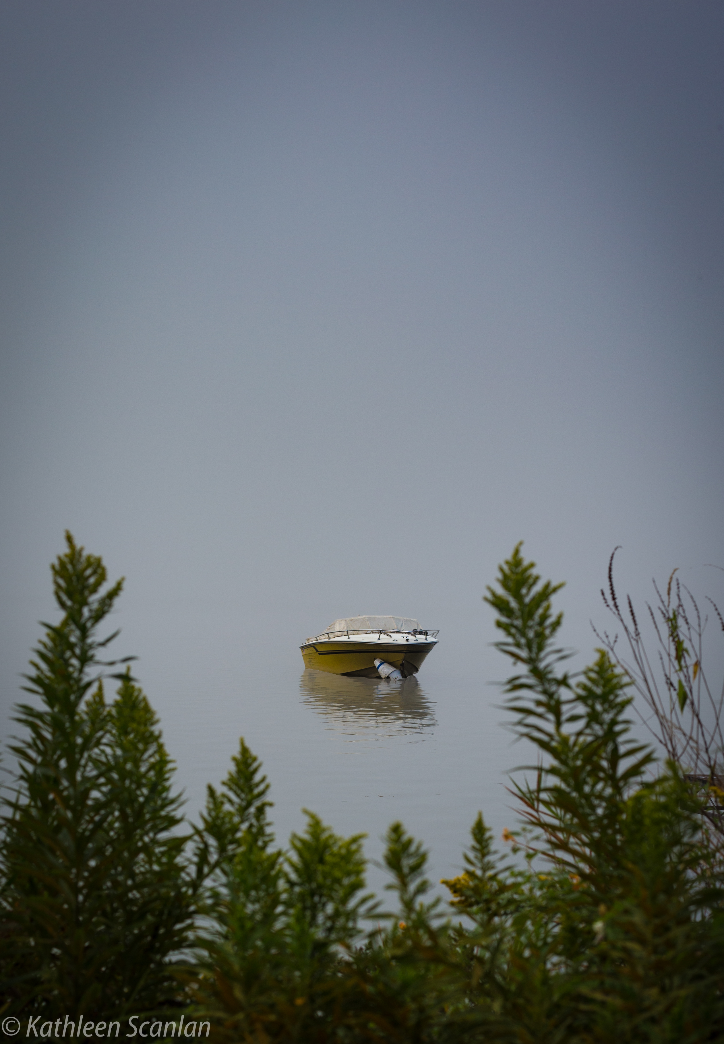
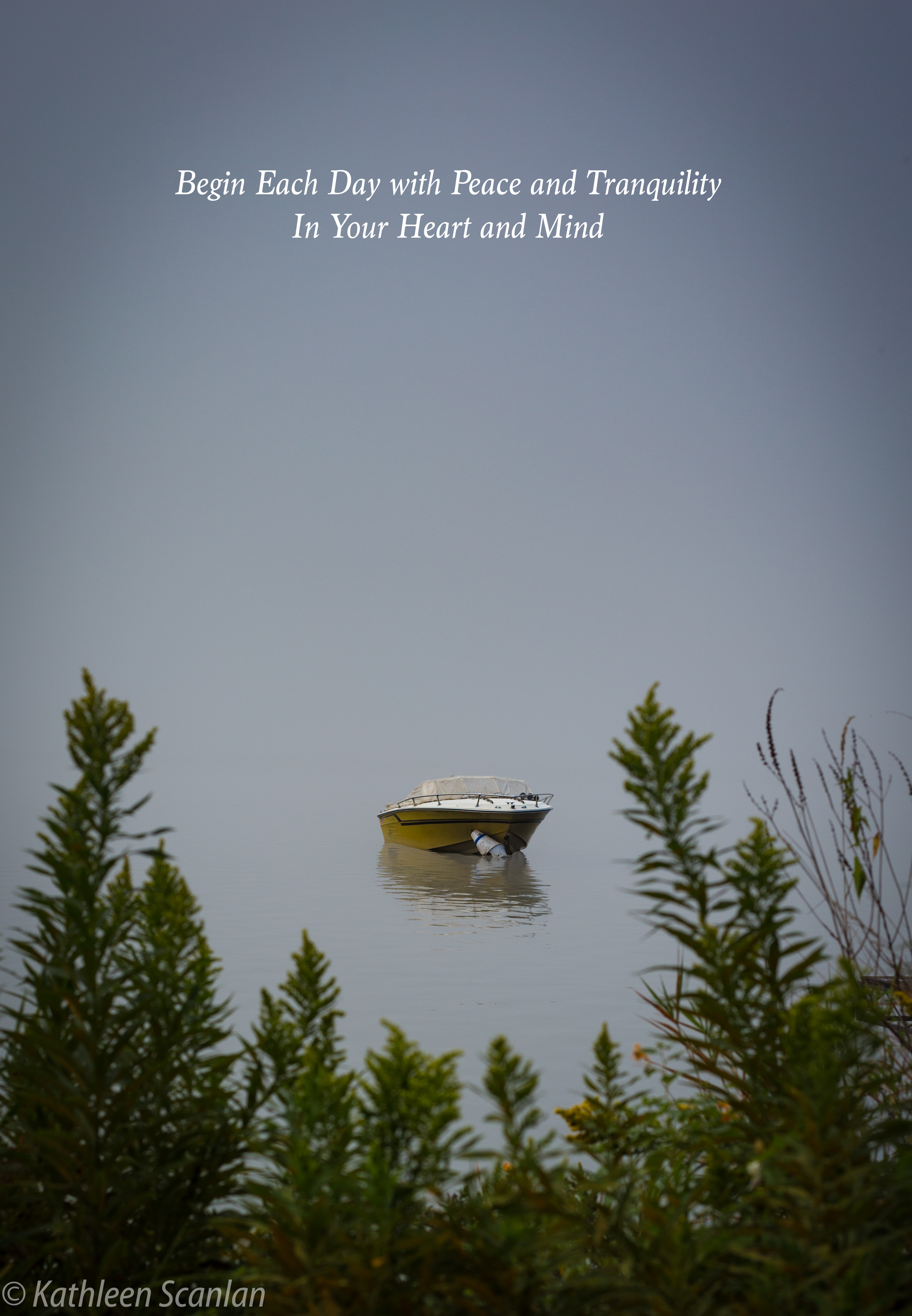
When shooting without a flash and with a bright background, the image in the front of the light will come out very dark. Now, no one wants the main image “in the dark”.  In the photos I am using for an example of bright backgrounds, I didn’t want to use a flash and didn’t want to lose the background either by opening up the stops to accommodate the image in the forefront.  So, I headed to Lightroom for a solution!

Orignal-7158.jpg

Lightroom now allows you to merge two or more images by compressing all the image data into one HDR image using very simple steps. Don’t be put off by “HDR”. In this instance of over-bright background, it is just a beginning point.  You can still adjust the final HDR product to your vision.

If you are steady-handed, shoot three or more photos with different speed stops without moving your focus.   For this article, I used my Canon 6D on a tripod and set my camera to shoot +/- one stop which means it will shoot the scene at a base stop that I set, then shoot ¾ higher (+3/4) and ¾ down (-3/4). I rarely do a full stop either way.  I set my ISO to 200 although I could have gone higher but didn’t want graininess in the images. Last but not least, my f-stop was set at 6.3.

Another way to shoot is to start at the high end of the speed you want to use and shut down a -1/2 stop for several more images.  The outcome will be the same.  This can also be done in reverse by adding +1/2 stop.

 The most important thing to remember when merging photos in Lightroom is that they are to be unprocessed. Another words do not do any post work on the images you plan on using.

Here are the two (yep, only two) steps for merging photos in Lightroom:

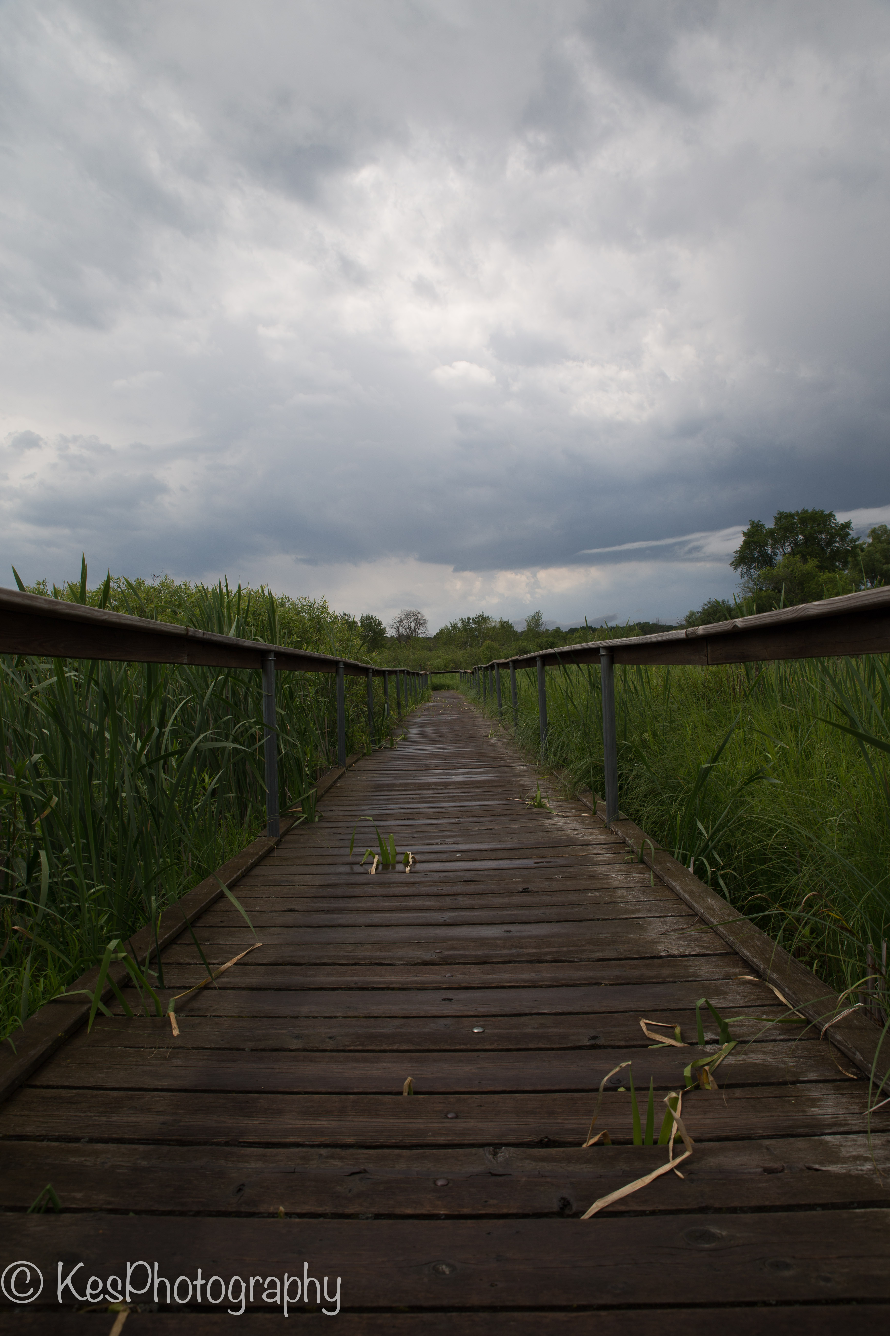
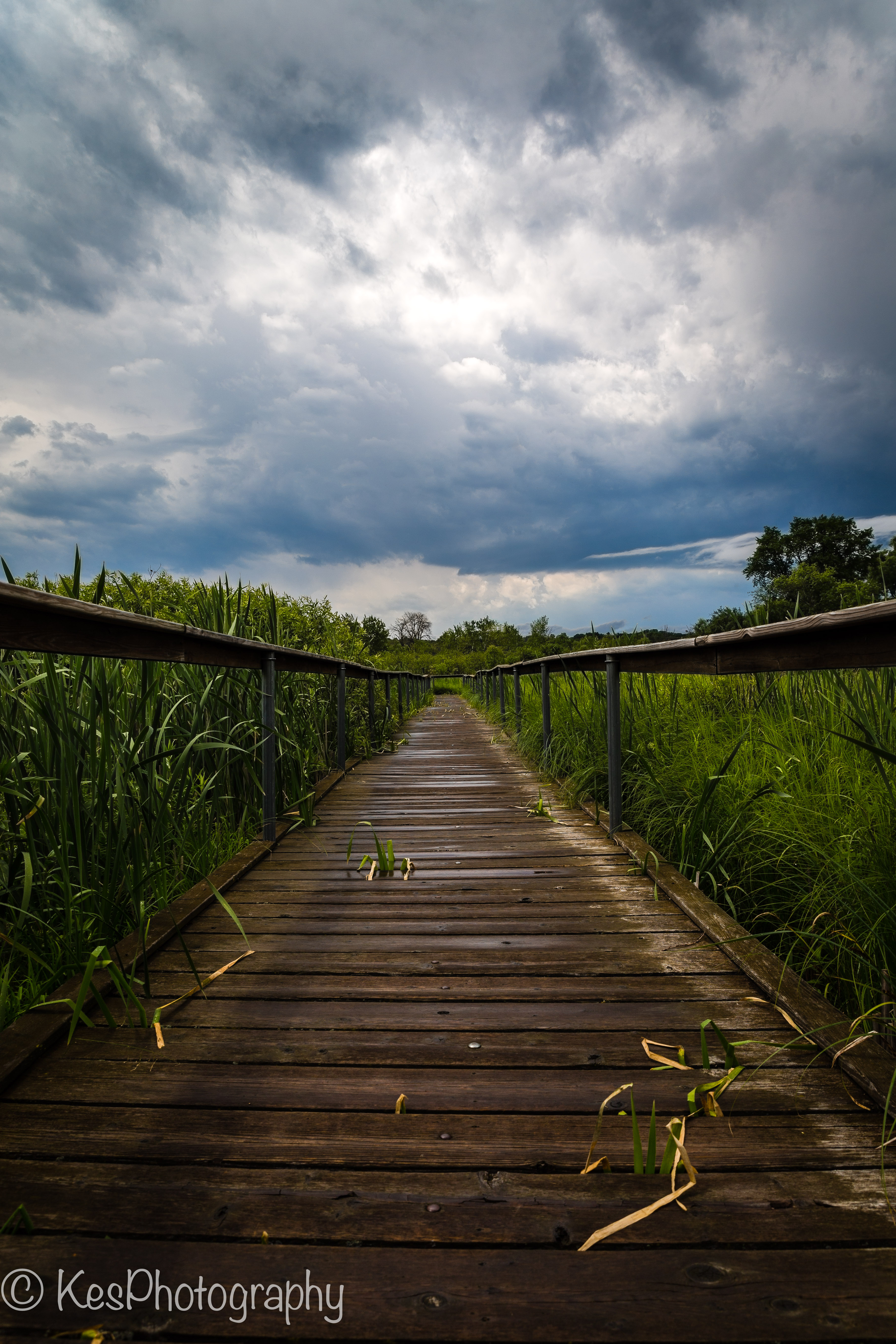
  1. Select the photos you wish to merge together. They have to be in consecutive order and have + or minus (-) speed settings for this to work (as mentioned above).  On a Mac, click on the first image and Cmd/Shift-click on the last image in Lightroom Classic CC to select the group of images you wish to use. I chose to use the three below.

Screen Shot 2018-03-07 at 1.29.11 PM.jpg

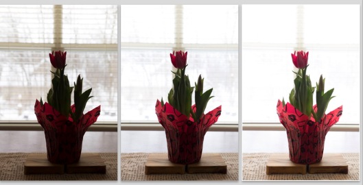
The histograms of each shot shows that I used shutter speeds of 1/80, 1/30, and 1/15 (the reason 1/60 is missing is because I deleted it before deciding to merge the images.  (Accidentally tripped over the tripod and the image was blurry!  Not a good idea…)

image 1.jpg Image 2.jpg Screen Shot 2018-03-07 at 1.32.16 PM.jpg

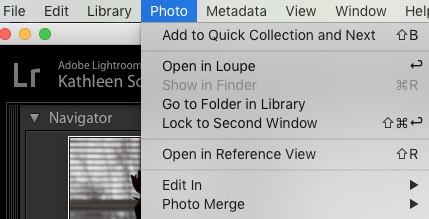
  1. Select Photo > Photo Merge > HDR. or press Ctrl+H.  Photo Merge is just below “Edit In”.

Step 2a.jpg

  1. Another box (HDR preview box) will pop open. This is where your final image will be created. You can select or deselect the following:

Auto Tone: Provides a good starting point for an evenly-toned merged image.  You can turn this off and see what happens.  Don’t panic if you see a dark image.  All the data is still there.  Lightroom just didn’t make adjusts; you can do this once  you accept the preview.
Auto Align: Useful if the images being merged have slight movement from shot to shot. Enable this option if the images were shot using a handheld camera. Enabling this option may not be necessary if the images were shot using a tripod.  The way to tell if you really need it is to zoom in on the image to see if everything aligns.

While you are making your choices, Lightroom is busy combining your chosen photos into one preview.

Screen Shot 2018-03-07 at 11.34.59 AM.jpg

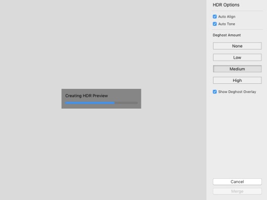
After deciding on those two options, you can choose how much “deghosting” you may need.  This occurs when some transparency from the one image to the next occurs while merging.  For example: a bird or plane flying across the sky. Each frame will have the bird or plane in a different position. You might see the ghost of the bird or plane in each position in the final image.  Deghost will take care of this.

You can preview the effects of these settings right within the dialog box once the image downloads.   Play with it a bit so you understand how the options affect your final image.  Then, accept the image.

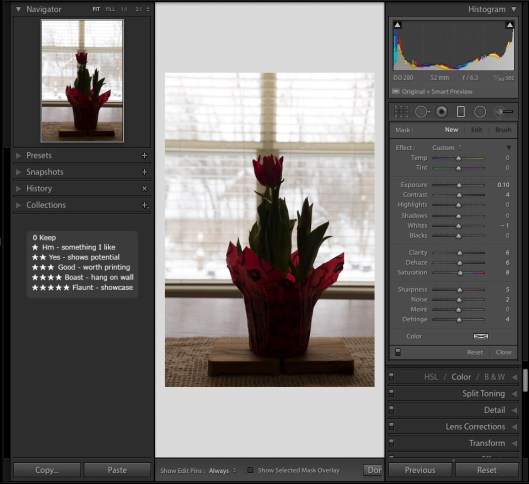
My final HDR image turned out to be a far cry from what I envisioned.  As you can see, it came out rather bright while the plant detail is nice and sharp.  A little too bright for me!  (Remember, earlier I stated that you can adjust your final HDR image.)

HDR 1-2.jpg


When you merge images in Lightroom, the program creates a new file/image. It combines all the data from the images you used to create the HDR image and compresses that date into one file. This means you can adjust the final image as if it was the original shot but with a whole lot more data to work with.  In my example, it probably had three times the image data since I used three images.


Because my final HDR image was not quite what I wanted (again, I could have turned Auto Tone off and made adjustments from that image), I decided to do some further adjustments in Lightroom on the new file/image.  Now the image looks much more natural and the details of the plant are still nice and sharp.  This, I like!

HDR Final-2.jpg

HDR 2a.jpgHDR 2.jpg


So the next time you want to play with your camera, try this neat trick out. Take several shots of one object, using several different speeds. Combined them in Lightroom and see what you can create. Have fun!

Advertisement

Share this:

  • Email
  • Twitter
  • Facebook
  • Pinterest
  • LinkedIn

Like this:

Like Loading...

Lightroom – How to Correct Backlight Issue

27 Tuesday Feb 2018

Posted by Kathleen Scanlan in Lightroom Tips

≈ Leave a comment

Tags

Background light, creativity, Lightroom, Natural Light, No Flash, Photo information, Photo postwork, Photography, Photography information, Photography postwork, photos

How many times have you taken a picture of a beautiful object with a bright background and didn’t want to have the harshness of a flash? Your eye sees every detail of that object and the light from the background just makes it pop, right? But then when you look at your image, it comes out like this:

Screen Shot 2018-02-18 at 2.50.43 PM.jpg

In the past, when shooting with film, this could be somewhat corrected in the darkroom if you were lucky enough to have one (I wasn’t so lucky). You would have to take several images at different settings and work with “stacking” them to catch all the detail, and/or dodge and burn in the darkroom. Even before all the wonderful programs out there for digital cameras today, you still had to frame your settings and combine those images into one.

Now, everyone can take a shot and change it completely in a post-processing program with ease. And in many cases, may not need to “stack” photos. Today, I am going to give you a step by step process to lighten forefront images simply in Lightroom Classic.

Step 1: Easy. Download your image to Lightroom and make any straightening, cropping, and/or spot removal at this point. Don’t worry too much about the cropping. I usually will do this at the end but it can be done at any time.

Step 2: Make a “virtual copy” to work on. Right click on original image. Look for “create virtual copy” in the drop down list. Click on it. (Always work on a virtual copy and keep your original “clean”.)

 Step 3: Under “BASIC” on the right side of the screen, bump up the exposure, adjust the contrast, highlights, shadows, whites and blacks. I always add a little bit of clarity. My adjustments are below.

Basic.jpg

REPEAT STEP TWO. (Right click on the image you are working on, not the original.)

Step 4: Move down to “Lens Corrections”. Check Remove Chromatic Aberration and Enable Profile Correction. Below that, make sure your lens profile is correct. It actually does change the image a bit based on what lens you use.

Lens Correction.jpg

Step 5: Next, click on the “Detail” section. Under “Noise Reduction, adjust the Luminance (I always do this with the image magnified to 100% to see the detail), and Detail. To ensure the program understood you want the color nice and smooth as well as the detail, adjust those also.

Detail.jpg

Step 6: “Effects.” This step also can be done at the end instead of here. I add some vignette at this point. No real reason other than it gives me an idea of how my finished image will come out as I continue to work on it.

Effects.jpg


You should immediately see some more of the object begin to appear as it has below.

second-7158.jpg

REPEAT STEP TWO. (Right click on the image you are working on, not the original)

Step 7: Now comes the fun part. Using the brush, which actually looks like a microphone with dots around the head, and laying sideways in the upper right corner of the editing side, you are going to paint in more light. I only wanted the flower to have more light and color, and not the background. First, bump up the Shadow slider to 100% so you can see what you are “painting”. Once you have the object highlighted, now move the slider down (in this case, I set my shadow at 32). You can now play with the sliders until the image is the way you want. My settings are listed below. Make sure you press the “done” button in the lower right section of the main image. You want these settings to remain as they are should you decide to do more painting later.

Brush.jpg

Step 8: After completing the last step, I decided to go back into “Basic” and readjust some of the sliders. My end result is not too bad. Just needs one more small adjustment.

Basic 2.jpg

And voila! After a little bit more cropping and Brush light adjustment the tips of the flower, I am pleased with the final product. The flower is not overpowering and the background light has been reduced. It looks natural. This is the outcome I wanted.

Final-7158.jpg

It may seem like a lot of steps (and it is!) but they are not difficult and only take seconds to do.

I know there will be those who might feel they would want more light on the flower. Remember this is from ONE image. You can only adjust the light in the image just so far before pixilation occurs. There is another process that would add more light but it entails combining several images taken with different setting. I will cover that in another blog.   In the meantime, have some fun playing with your sliders and Brush in Lightroom.


Share this:

  • Email
  • Twitter
  • Facebook
  • Pinterest
  • LinkedIn

Like this:

Like Loading...

“What Happened…?”

08 Friday Dec 2017

Posted by Kathleen Scanlan in composition

≈ Leave a comment

Tags

composition, creativity, distortion, focus, image corrections, perspective, photo corrections, Photography, Photography information

Have you ever taken a picture and when you printed it out or viewed it on your computer or camera it didn’t look like the picture you thought you took? This is especially true when shooting buildings. Your eye sees the building as nice and tall with straight lines aiming towards the heavens. Yet, when you take the picture and look at it, it’s distorted? It happens a lot to beginners and even us in the middle. And then the big question becomes “why is this happening?”

I am not a pro nor am I beginner. I’m somewhere in the middle when it comes to photography. This means I enjoy taking images, manipulating them, and sharing them with those of the same mindset. So, I try to keep things simple and easy to understand. No technical verbiage for me. I’m that “whatchamacallit” person.

So here it is…one reason is that your perspective is off. For example, when you shoot close to a church and you step back to get the steeple in, you are changing the perspective. In the image below, you can see that the doors appear straight but as you take in the whole image, the rest of the church is distorted. The large windows seem to tilt in on the sides and everything in the middle seems to be fairly straight, although a bit tilted backward. Probably without even knowing it, you have had to tilt the camera up to capture the cross on the church as well as the front door.

Church #1-6667

I was standing just below the church, aiming slightly up which distorted the whole church except for what was at eye level (the doors) from where I was shooting. My lens was a 24-70mm zoom and I had it set at 24mm. It just didn’t work and I couldn’t step back any further as a very active street behind me restricted me from doing so!

How to correct it? Well, you can do several things:

  1. Change your angle. Step back so that you do not have to tilt your camera to capture the whole image. Sometimes you aren’t even aware that you are slightly tilting the camera to get everything within the camera frame.
  2. Not possible?  Option two is to not take the whole church. Move closer and capture just a window or the doors.
  3. Use a wide angle lens (if you have one)
  4. Take the shot the best you can. Then, in post processing, straighten it out as much as you can without causing more distortion. (More on this later)

I adjusted the horizontal and vertical lines of the image in Lightroom to help “straighten” out the church. As you can see below, I lost a lot of the content of the picture in post-processing. But at least you won’t get dizzy looking at it!

Church #2-6667

If you can’t change your position and don’t have a wide-angle lens, take the picture. Just ensure that your image doesn’t fill the frame like I did in the first picture and has plenty of border space around the church for post-process straightening. I didn’t and lost quite a bit of the image when I corrected the horizontal and vertical distortions in Lightroom.

This last image is of a church I had plenty of room to change my position to reduce the  in-camera distortion.  Although there is still a little bit of distortion, it is not very noticeable and the image is pleasing to the eye. (The small entrance to the right really was tilting toward the main building…!)  I did make some minor perspective changes, i.e., cropping/leveling and a little correction on the horizontal lines.  Other than that, this image is how I saw that little farm church that day.

Church #3-0741

So, the next time you are taking a picture, check to make sure your perspective is good; that you are on equal footing with the object that you are taking. If you don’t have the room to do that or a wide angle lens, then make sure you have enough clear space on all four sides in the viewfinder so that when you make your corrections in a post-processing program such as Lightroom, you don’t cut off anything of importance (like the cross on top of the steeple!).

There is another reason why the distortion occurs and it has to do with the camera itself.  And the fact the world is round!  But that’s for another blog…  Until next time, happy shooting!

Share this:

  • Email
  • Twitter
  • Facebook
  • Pinterest
  • LinkedIn

Like this:

Like Loading...

Composition and Lines

17 Friday Nov 2017

Posted by Kathleen Scanlan in composition

≈ 2 Comments

Tags

composition, creativity, focus, garden, gnome, lines, Photography


Hi Everyone. Building on my last blog about lines in images (November 10, 2017 “Leading Lines”), this week I thought I would show you how composition and lines really work hand in hand. There is no doubt that there are shots which probably will not have any apparent lines to follow but if you look, you will find them!

When composing a shot, whether it is a portrait or a simple landscape, its always important to double-check what you see in the viewfinder. As mentioned in previous blogs, with practice it will become second nature. Watch for things cut off by the edge of the frame or something sticking out of your subject’s head that shouldn’t be there! Although the latter might be funny at first, the subject might not think so later. Now, if that was your intent, to have a tree growing out of their head well…great!

The images I have below are from my backyard garden. I love shooting with natural light and really enjoy capturing it at all angles when I can. Today, I want to show you how to create a story with your image without words. The title of these images is Garden Cop. My thought process was to capture this little figure peeking out from the flowerbed. I wanted the viewer to get the sense that this little guy was looking out for the flowers and was working his beat, doing his duty.

Although the image does have something of the rule of thirds on an angle (upper right corner empty, bottom left filled with flowers, and center angle with the subject matter) drawing the eye to the little officer, the greenery is going every which way. It just does not feel balanced. The lines of the greenery really don’t point to any one thing. Not a terrible image but could use some improvement.

Compo2-0036

So, I changed my position and focused on the statue’s face. As you can see, the green lines now frame the face pretty good but are such a distraction that its difficult to really determine what I was aiming at with the image. Yes, I wanted to focus on the cute face, but all the greenery pulls the eye to the unfocused forefront of the image. Way too busy. The face looks so small in the image that the story gets lost. It’s just a shot of a statue in a garden. …Kind of dull, to my way of thinking.

Compo1-0044

My final product is what I was looking for in an image. By slightly changing my position from the front of the statue, focusing on the face, and watching the green “lines”, I captured this little copper on his beat in the garden. As you look at it, the left side is not longer so thick with a mishmash of lines and they are now in a soft focus. The wall on the right is slightly darker in the shade, and my copper has enough sunlight to draw attention to him. Although the face is in shadow, it looks natural. As you can see, I framed his upper body with the greenery so the viewer is focused on the statue.

Compo3-0037

In the end, I had to really look for the image lines, make sure they helped to focus the eye on my subject, and move around until I had the right composition to tell my story. Did it work?

Everyone takes pictures today. Everywhere you are, you can see someone snapping off a shot. What makes one image stand out against another is the composition. Did the photographer clearly identify the subject matter? Is it in focus? Are there distracting lines disrupting the flow of the image? When you look through your viewfinder, ask yourself this…”What is it that I want my viewer to feel and see?” “How can I help him or her focus on what I want them to feel and see?” “How can I take this average shot and make it into something wonderful?”  If you ask these questions of yourself before you take that shot, you are on the road to a great composition. One that will take their breathe away and have them asking you “how did you do that?” Have a great day and have fun with your camera!

Share this:

  • Email
  • Twitter
  • Facebook
  • Pinterest
  • LinkedIn

Like this:

Like Loading...

Image

Is it Real or Post Work?

25 Wednesday Oct 2017

Tags

creativity, images, photo work, Photography, post-work, programs, pure photography

There is quite a conversation going on around the internet regarding photography and “pure” photography. Strange, but I never thought of it that way, even back in the “film” days. But apparently, with the onslaught of programs that help to enhance the original image from the camera, (some cameras have built in programs for that), the cosmic question has become “which is better? Pure photography (downloading and accepting whatever the camera captures, good or bad)? Or, images that have been adjusted in post work programs?  To me, the better question is; what is it that you want to accomplish with your image?

My favorite photographer is Ansel Adams.  You can still see his landscape photography everywhere.  He is known for capturing the landmarks and landscapes of the United States and is emulated by photographers worldwide.  Those who really don’t know him, believe his images are simply what he captured in camera.  The reality is, he did his best work in the darkroom.  Mr. Adams knew what he wanted his final products to look like and worked on his images until they reflected his “vision”.  His work, comprising of the National Parks of the United States, still capture the essence of the forests, rock formations, and the American landscape to this day.

I have read blogs as well as discussions on Facebook and other areas of the internet regarding this issue and people on both sides of the fence are very determined to convince each other that they are right. Just like politics…  I too would love to shoot a picture and have the camera do all the work for me (provided the camera knows exactly what I am striving for in the final product).  There are times when it is spot on but more times than not, the camera catches a dark area that my eye did not “see” or a glare which could have been be caused by the sun hitting the lens.  Or it reads the light as being too bright behind the subject matter because it registers all the light coming into the lens and adjusts for it, and the subject matter becomes a “shadow” in the image and the sky or background come out perfect with beautiful blue and white skies.

Below is an image I caught with my camera.  Using my manual mode, I made adjustments so that the sky wasn’t blown out and the foreground didn’t come out too dark.  To me, its a “blah” picture.  Not exactly what I actually saw that day.

This is what I actually saw.  Had to do some post work to pull out the beautiful stormy sky, the saturated colors that pop on overcast days, and added a bit of clarity to pull out more definition of the pathway.  My final image is below.  In this one I can actually see the beauty and “feel” the storm rolling in.  Which one do you like?

You can shoot in auto mode and have beautiful images to show off.  But there is a limit to what the auto mode can do, too.  Have you ever shot an image and then when you downloaded it, the final image wasn’t quite right? The shadows were too deep or or the sky and clouds just were a white blur?  But, your eye didn’t see it that way when you initially took the shot.  Your brain saw the beautiful blue sky with the white, fluffy clouds passing by, and the colors were vibrant.  Our brains make the adjustment so quickly, we don’t even notice it.  Our eyes automatically make subtle changes so we “see” everything in its splendor.  So, until the camera has a “brain” that can catch up with the many variables the human eye adjusts for automatically, I can proudly say I will never be a “purist”.


Share this:

  • Email
  • Twitter
  • Facebook
  • Pinterest
  • LinkedIn

Like this:

Like Loading...

Posted by Kathleen Scanlan | Filed under Photography

≈ Leave a comment

Negative space…good or bad?

30 Friday Oct 2015

Posted by Kathleen Scanlan in Photography

≈ Leave a comment

Tags

creativity, Dehaze, Lightroom CC, negative space, Photography

The art world (which includes photography, by the way!) has a language of its own that those who are not part of this community might misinterpret. My favorite one is “negative space”. I have heard this phrase many times and wondered what it really was. Was it good to have in an image? After all, the word negative has, well, negative connotations! So it must not be a good thing, right?

Well, not exactly.  This term actually can be a very good thing.  To explain it simply, the phrase is interchangeable with “uncluttered” or “open space”.  The image below is one that has negative space.  It was shot early on a foggy morning when the other side of the lake was so bogged down with fog, it looked like the lonely boat was floating on air.  I used the bushes along the shoreline to anchor the bottom corners (and I like that “window” look as if the viewer is peering into the frame).  The emptiness from around midpoint to the top of the frame is considered negative space.

Early morning fog on Lake Como in the summer

Early morning fog on Lake Como in the summer

Why have empty or negative space in a shot?  There are several reasons that I can think of to have it in the frame.  The first one is obvious.  It focuses the eye on the main object, which in this case is the boat.  Another one could be that I may want to add text to the image.  Or maybe, even change the background in post work.

My settings on my Canon 6D were:  ISO 200, 50mm primary lens (meaning it was not a zoom), f/7.1 (Aperture), and Shutter speed of 1/100 sec.  I did not use a lens filter although one would have cleared up the haze in the image.  You can see that the fog/haze tends to soften the boat and makes it slightly indistinct.  But, since I knew I had a program that allowed me control over how much of the fog/haze I wanted to remove, I decided to go filter-free.

I use Lightroom 5CC by Adobe when I download and backup my images.  It affords me the opportunity to slightly change things and still have all the data filed together without creating a large file when I save those changes.  The image below is the same image as above, only with some slight post work.

Added some post work

Added some post work

In Lightroom, I used the “dehaze” tool located under the tab “Effects” to clear up a little bit of the fog so the boat would stand out a bit more.  It deepened the color and shadows of the bushes along the shore.  After completing that, I used a brush to clarify (another way to bring out detail and add a bit more definition) and increase color saturation to the boat.  The background and foreground were not affected.

The two last images show what you can do with negative space.  Again, all my initial work was completed in Lightroom.  I tend to add vignetting to my images to tighten the viewing area a bit.  For me, it looks better having the fog “contained” inside the image.  But you might not.  It really is up to you.  The second image has added text that I completed in Photoshop.

A little vignetting and the fog is contained!

A little vignetting and the fog is contained!

The final product!

The final product!

This is just one example of negative space and what you can do with it.  A shot of a leaf on a sidewalk, an object on an empty table, or a person walking down a wide, lonely road.   Negative space can be created in many different ways with just as many different results.

What would you do with it?  Take a picture of a child blowing out a candle with the background completely darkened and only her face, cake and candle visible?  a couple of children (or even just one all alone) playing in the sand on a beach with no one else around?  An apple on a wooden table at eye level in an orchard, with the orchard itself deep in the background and out of focus?  Get your creative juices flowing and give it a try.

So, the next time you take out your camera, consider adding negative space in your images.  Keep your composition clean and clear.  You might find that you like the uncluttered look!

Share this:

  • Email
  • Twitter
  • Facebook
  • Pinterest
  • LinkedIn

Like this:

Like Loading...

Subscribe

  • Entries (RSS)
  • Comments (RSS)

Archives

  • March 2018
  • February 2018
  • December 2017
  • November 2017
  • October 2017
  • October 2015
  • September 2015

Categories

  • composition
  • Lightroom Tips
  • Photography
  • Uncategorized

Meta

  • Register
  • Log in

Blog at WordPress.com.

Privacy & Cookies: This site uses cookies. By continuing to use this website, you agree to their use.
To find out more, including how to control cookies, see here: Cookie Policy
  • Follow Following
    • KES Photography
    • Already have a WordPress.com account? Log in now.
    • KES Photography
    • Customize
    • Follow Following
    • Sign up
    • Log in
    • Report this content
    • View site in Reader
    • Manage subscriptions
    • Collapse this bar
 

Loading Comments...
 

    %d bloggers like this: